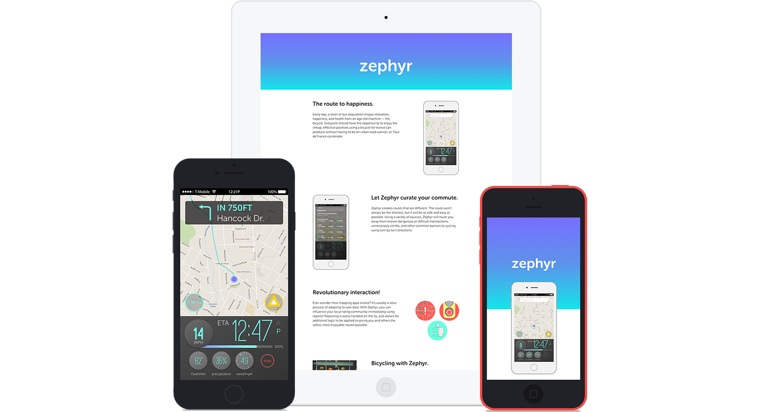
A Conceptual App For Bicycling
Project Overview
This project took place over a two week period at the end of my course with The Iron Yard. The project encompassed much of what we'd learned (and some we didn't).
The process involved a hefty amount of research before the design could begin. Requirements were to have a prototype built in Pixate, and a responsive single-page website.
Zephyr is hosted with Github and Pixate, and is viewable online and with the Pixate app.
Concept Overview
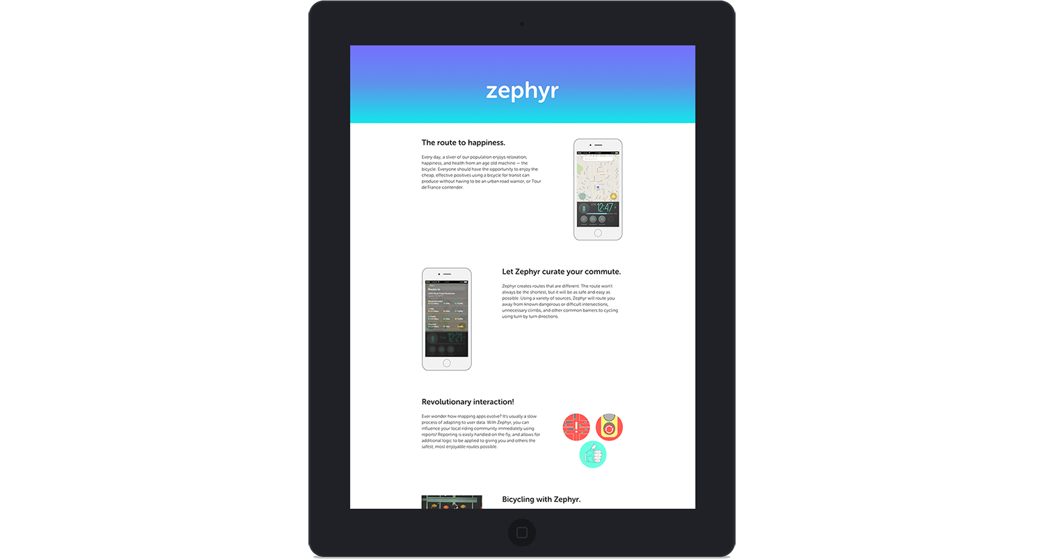
Zephyr is a conceptual app that will take existing map data (topography, road ways, bike lanes, traffic), and combine it with user-sourced data (anonymous tracking, issue reports). Zephyr will use that information to provide bicycle commuters with a safe and easy route.
With this app, we could increase bicycle commuting in Austin. Cities benefit in many ways from having a larger bicycling population. One of the largest is that the city becomes happier and safer.
Research & Discovery
Even though I had an idea, I needed to verify my hypothetical solution with research. Design requires research to provide direction when taking on a project.
Questions & Surveys
Research began with a survey I created using Google Forms (view the form here). I sent this form out via a variety of channels and waited. When incoming response frequency slowed down, I began analyzing the data. Responses varied, but fell within several key areas of focus. Traffic, routing, and weather were the predominant issues.
“The bike lanes are worse than a joke — they're on major roads and they'll just disappear for a block or two...”
I solicited friends who are active in the cycling community along with the survey. Generally, the responses were in line with each other. They underlined Austin's bike infrastructure as being better perceived than it actually is.
General Research
Throughout the project, I used resources like Bike Austin, The League of American Bicyclists, and Copenhagenize to back up the data I'd collected myself. I made notes of information that may not directly pertain to my problem, but could assist in design direction.
Competitive Market Analysis
I used a competitive market analysis to see if a similar product already existed. I also wanted to know what competing products might offer. The cycling app market is full of apps targeted at recreational cyclists. Few apps exist to help the commuting cyclist.
Ride the City is an app that offers "safer routes" as a solution. Issues cited by users included a cumbersome and unattractive UI, and poor routes specifically in Austin. It was difficult to locate information on how Ride the City creates routes. Without an understanding of how the app builds routes, a rider could be unsure of their commute. The community features seemed lacking, providing large opportunities for improvement.
Inspirational Apps
I looked to a few apps for well designed and thought out UI. Strava and Waze are two that provided inspiration. I'm a heavy Strava user, and love the clean and modern UI, high on contrast with plenty of gamification. Waze is clever with its hands free actions and is known for user reports. The reported issues serve as temporary alerts, or help to reroute other users.
Personas
I created personas to help distill my possible user base and aid in design decisions. These were created using my research. The personas show people who are already willing to use a bike as transportation. View the personas on github.
Design
The Design process was split between the app prototype and the website. Throughout this process, I sought feedback to verify the design direction matched my intentions.
Style Tiles
Style tiles give a rough idea of how color palettes, fonts, patterns, and other elements may work together. After creating 3 tiles, I asked for feedback. Taking that feedback, I created the 4th tile which dictated Zephyr's design direction.
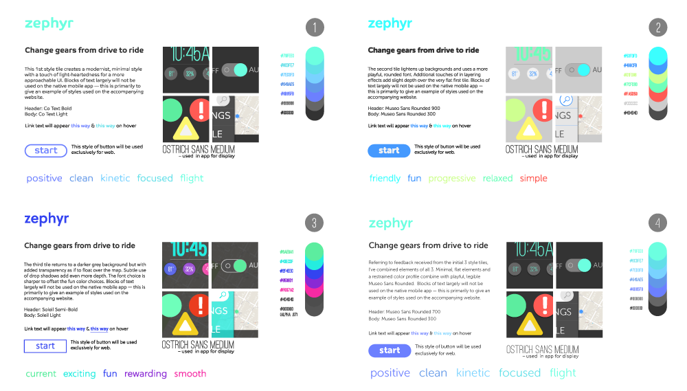
I wanted Zephyr to have a fun but calm feeling. I used vibrant blue hues to create contrast with dark greys for legibility. Zephyr's primary font is Museo Sans Rounded which is a modern and friendly sans-serif. I chose Ostrich Sans Black for dashboard numbers. Ostrich Sans' condensed, sleek, and modern appearance allowed large numbers for at-a-glance viewing.
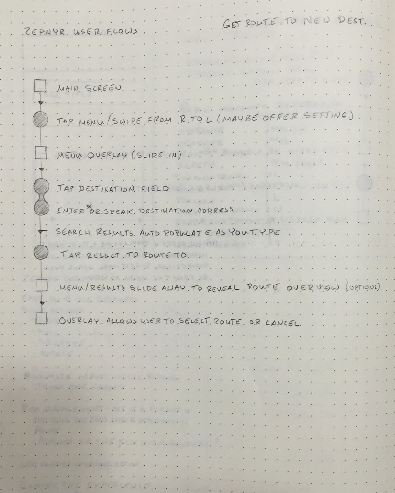
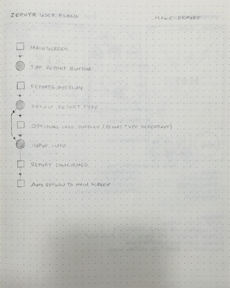
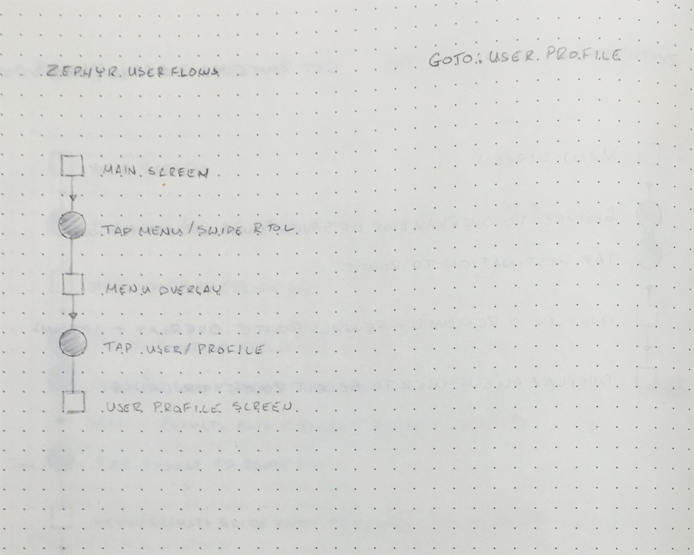
User Flows
I mapped out primary functions with user flows to get a mental road map before sketching layouts. User flows often provide me with great opportunities to imagine the interface while staying focused on a feature. Creating user flows is important for me when creating a mobile design.
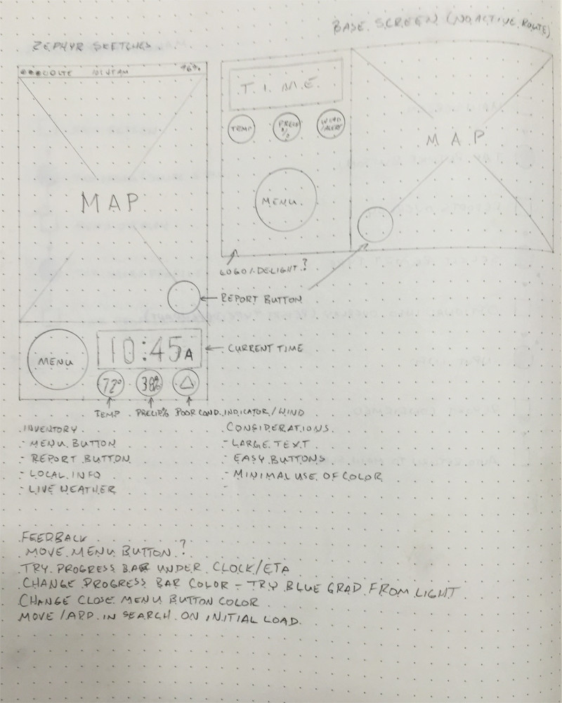
Low fidelity sketches
Sketching provided an easy way to begin taking UI inventory and solidifying layout ideas.
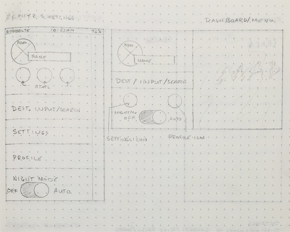
Wire frames
Wire frames were created for two screens using Sketch. I find Sketch's artboards feature makes creating wire frames much easier. Landscape was not used in the prototype, but I wanted to consider it as a possibility. Thinking about the landscape layout helped me create components that could be modular.
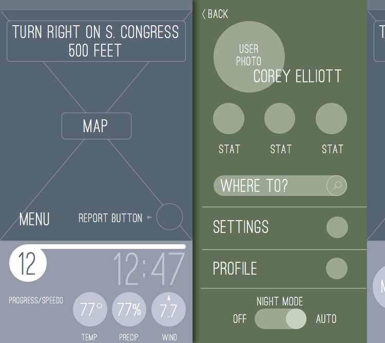
High fidelity mock-ups
High fidelity mock-ups were created with Adobe Illustrator. After the mock-ups were created, I built an asset "guide". The guide consisted of all the individual UI assets to be exported for use in the prototyping stage.
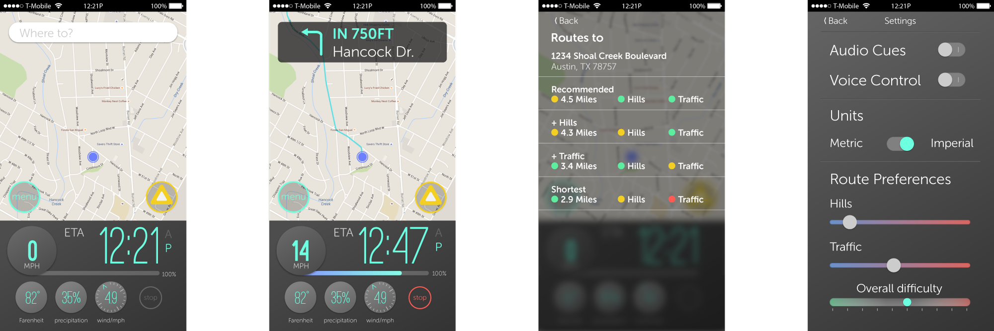
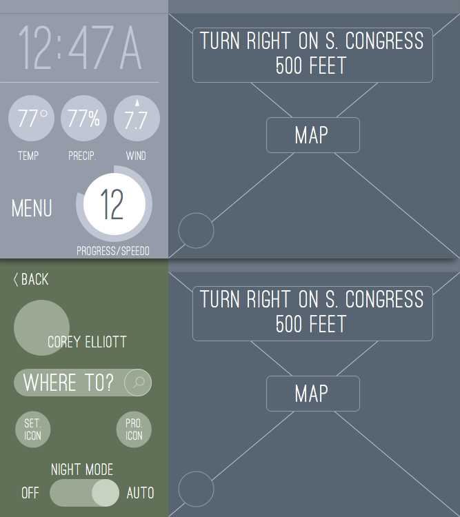
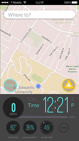
Pixate Prototyping
I used Pixate for prototyping — chosen for a relatively easy learning curve and powerful interaction creation.
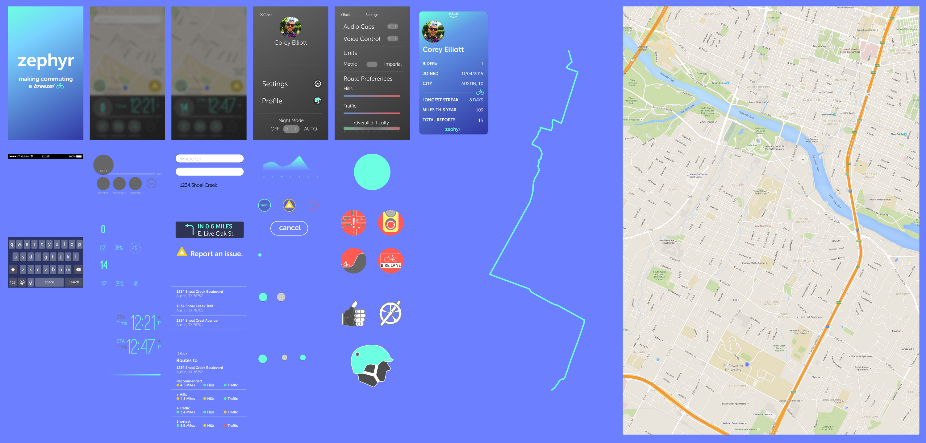
During the prototyping phase, I was always aware of how the product would be used environmentally. I also concentrated on the feedback I wanted the user to receive. I focused on simple, responsive animations to prevent disorientation within the app.
Website Rapid Prototyping
Once the app prototype was complete, I needed to create a single-page site to display Zephyr's use and feeling. The rapid process involved minimal sketching and brainstorming before coding began. I used responsive web design principles and technologies with mobile first thinking for the site. View the responsive site.
Technologies Used
- HTML5 w. semantic markup
- CSS pre-processor (SCSS)
- Media queries for responding to different screen sizes
- Bourbon by Thoughtbot (SCSS Library)
- Jquery w. Slick carousel plugin
Challenges
Creating the Zephyr prototype involved several challenges that had to be overcome. Two stick out in my mind — time management and learning Pixate during the project.
Time management
It was easy to feel overwhelmed looking at a list of tasks while knowing how compressed the time line was. During the research phase, I split my time working on several tasks. Previously, when working as a graphic designer, I didn't have so many different tasks to keep track of, and I thought this might be the best way to manage them. Some of the tasks required me to wait (like the survey), but in hindsight I multi-tasked to feel like I was getting more done.
I caught on to this near the end of the research phase and made a shift towards focusing on a single task. Concentrating on a single task until it was complete (or I hit a road block) allowed me to keep a rhythm. At the beginning, I would be working on a task and the other tasks I was juggling would be distractions. Focusing on finishing a task freed me of those distractions.
Learning on the job
Learning Pixate was both fun and challenging. The challenge with Pixate wasn't because it is a complex User Interaction application. The challenge was learning a tool and incorporating it into your workflow during the project.
I planned knowing that I would come to the prototyping process at the end of the project, when deadline stress is at its highest. I began reading Pixate's online documentation and watching their tutorials in the evenings. Once I began building mock-ups, I took a few components and exported them. I imported these assets into Pixate, and had something to practice with.
By the time I had begun to prototype, I already had a foundational knowledge of Pixate. I devised a component "guide" to make sure I had all the assets required without duplicating them. The guide allowed me to export all items in order, add them to Pixate, and layer/animate them as needed.
Learning the tool ahead of time, and figuring out an approach, greatly reduced the amount of time I expected to spend prototyping.