A conceptual site redesign of Goodreads
Project Overview
Goodreads is a website for readers that offers great book related content and features. That strength is also a weakness. The amount of content is massive and crammed into a dusty, dated design.
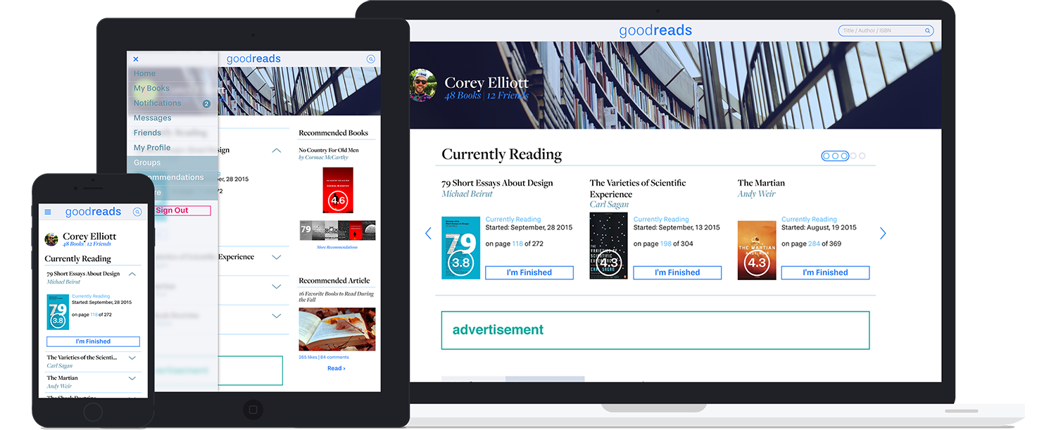
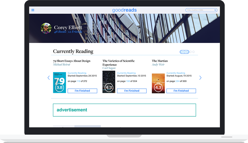
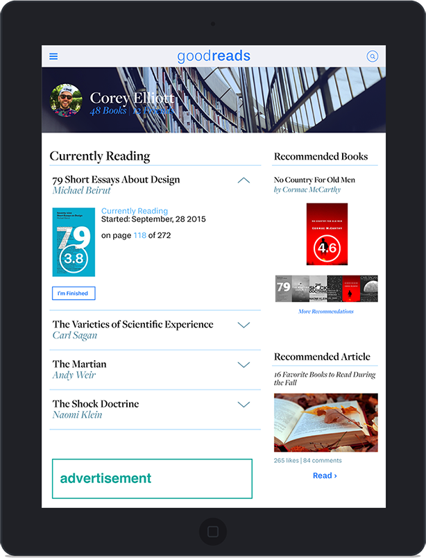
I wanted to redesign the Goodreads main user page with better content management, a more modern design, and a less claustrophobic feel. It was important to not alienate existing users by removing key features. The end product was a high fidelity mockup in three screen sizes.
Concept Overview
Goodreads' current website tries to offer up a lot of features all at once. As a Goodreads user, I knew that book tracking as well as recommendations were important features to a majority of users. I wanted to make these front and center and manage the clutter.
Goodreads' design is very bookish — feeling like a dusty old library. That could be a good thing for a particular user, but I felt there was an opportunity to let some light in with the organization.
Research & Discovery
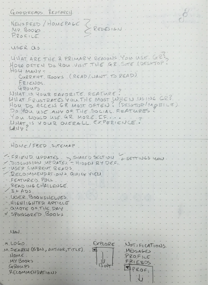
For the Goodreads project, I spoke with current users to see what primary and secondary features they used most. During this phase, I quizzed friends, family, and peers that shared our work space. Besides the features I inquired about, I asked their thoughts on Goodreads website design.
Some echoed my thoughts on the website, while others didn't mind the current design theme. That some users were seemingly not bothered by the design was a surprise to me.
content list and management
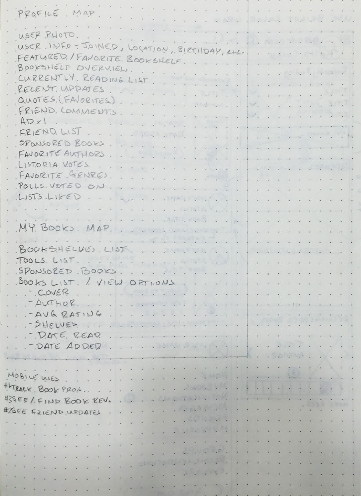
To see what I had to work with, I created a list of the content found on main pages. Prioritizing the content would help in the design phases.
Personas
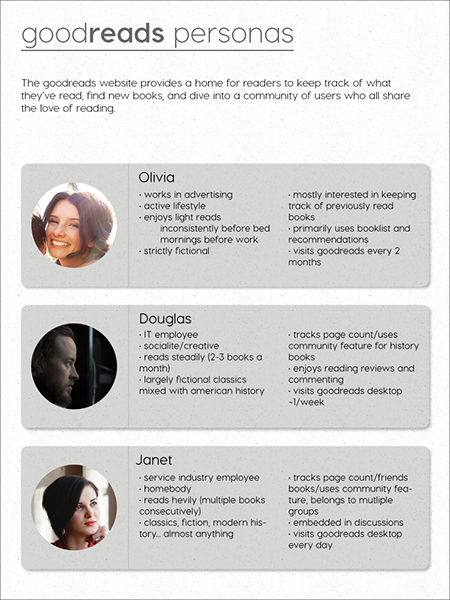
Personas helped direct the redesign for this project with an overview of use levels (light to heavy).
Design
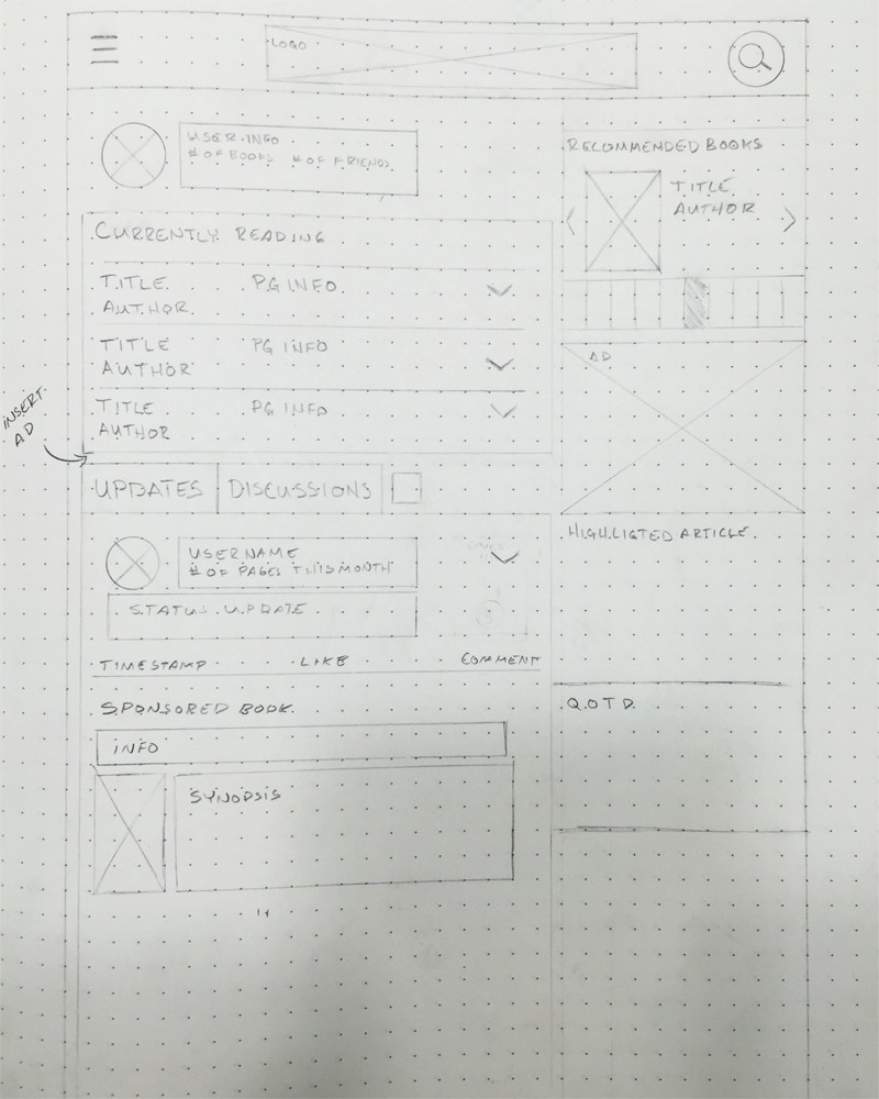
For the design process, I created three style tiles, sketched out basic layouts, and then proceeded to the Illustrator mockups.
Style Tiles
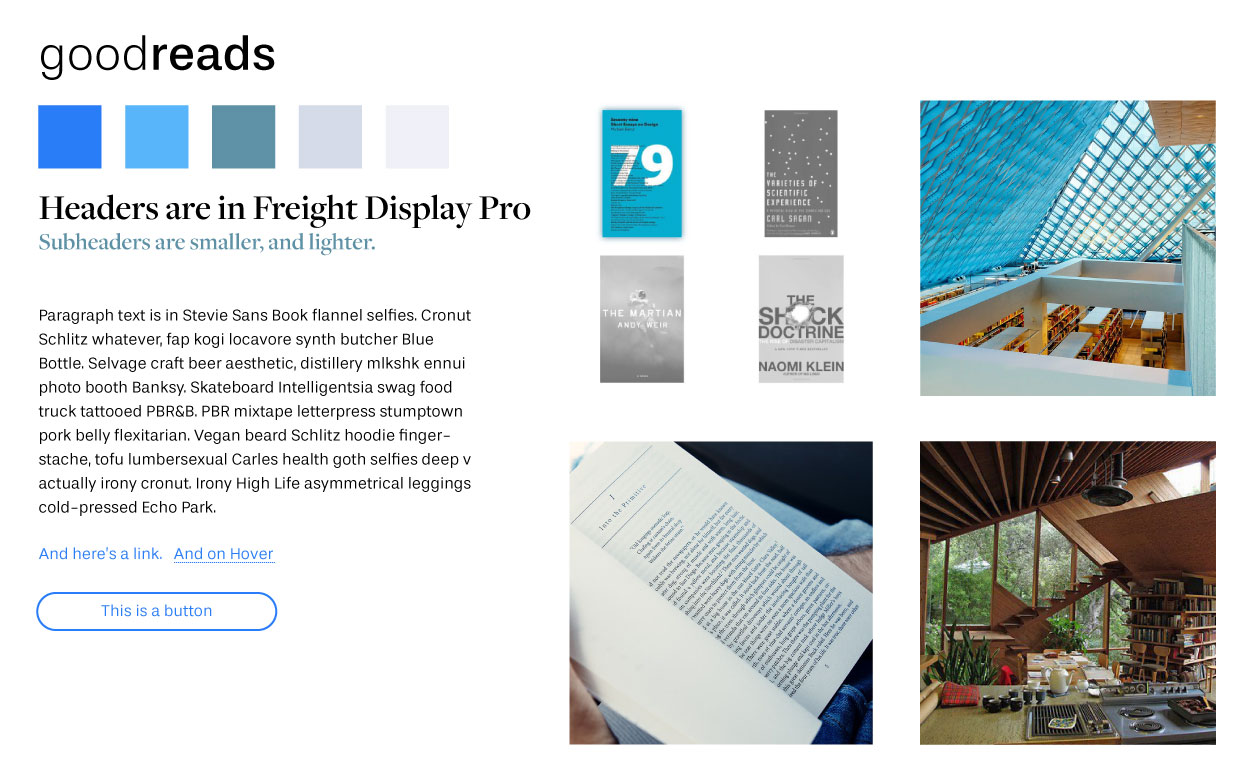
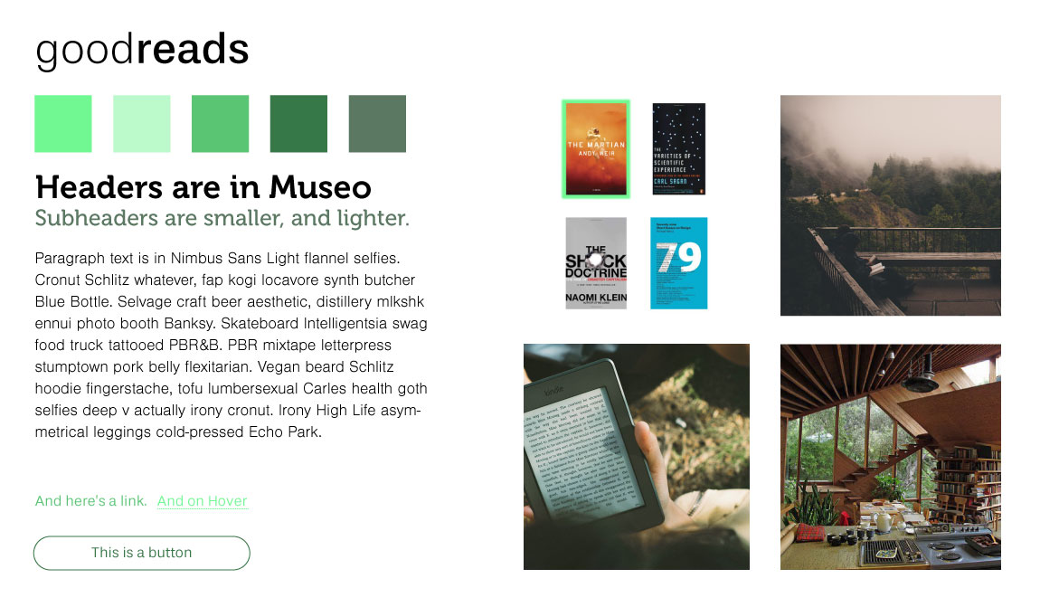
For the Goodreads project, I wanted the style tiles to create the feeling of modern libraries. The tile I chose has calm blues and clean, legible typefaces. I believe the font combination offsets the more modern color palette.
Low fidelity sketches
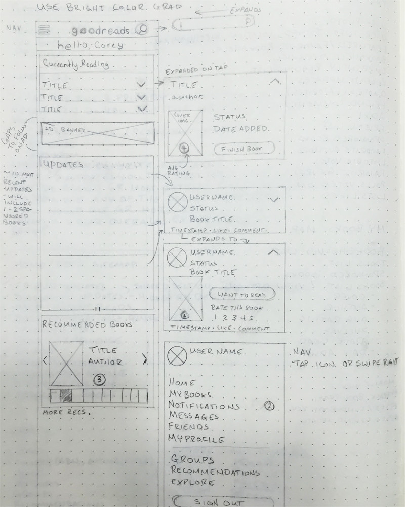
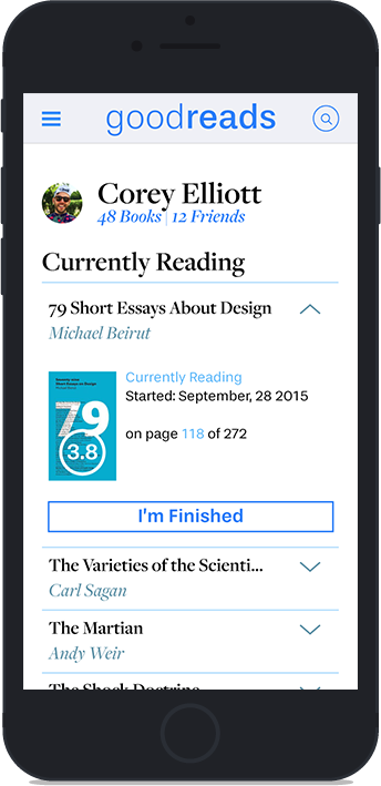
Sketching started with the mobile layout. Quick access to book statuses and updates was something I focused on. User feeds and book recommendations were secondary — everything else being tertiary.
High fidelity mock-ups
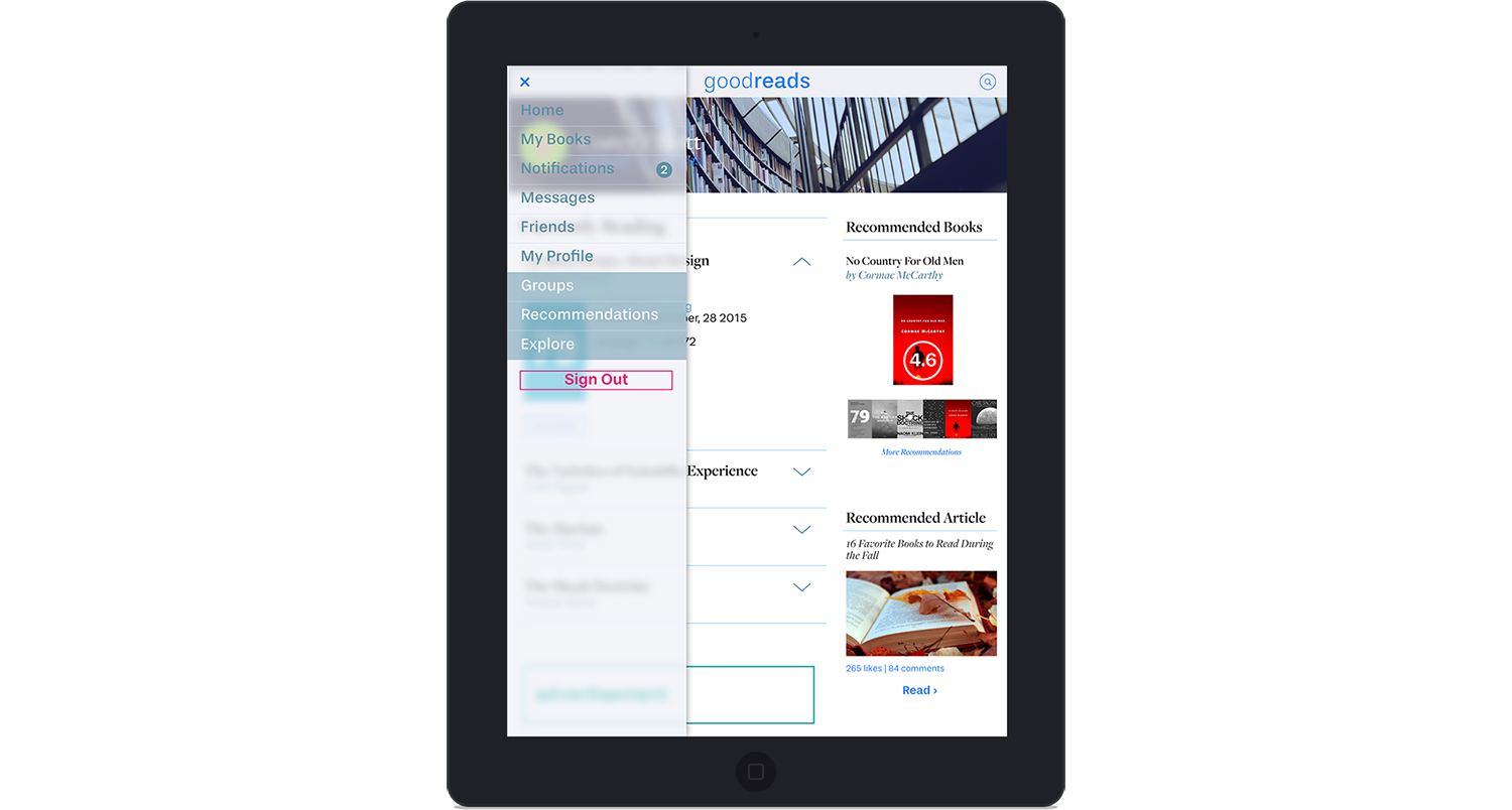
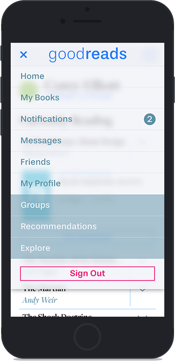
With the mockups, I focused on a clean and airy feel. I wanted a lot of bright white negative space to give the experience of a fresh book or reading on a tablet. There is a dearth of texture outside of the slide-in "frosted" menu.
Challenges
This project involved a heavy amount of decisions on features and content. The biggest challenge was cleaning up the interface and thinking of the current user base. It was possible to move content to other pages, but I couldn't remove it.
My mobile first thought process was reinforced through the process of content management. Additionally, I learned user data feedback is imperative when redesigning an existing product — not just at the end, but throughout the process.